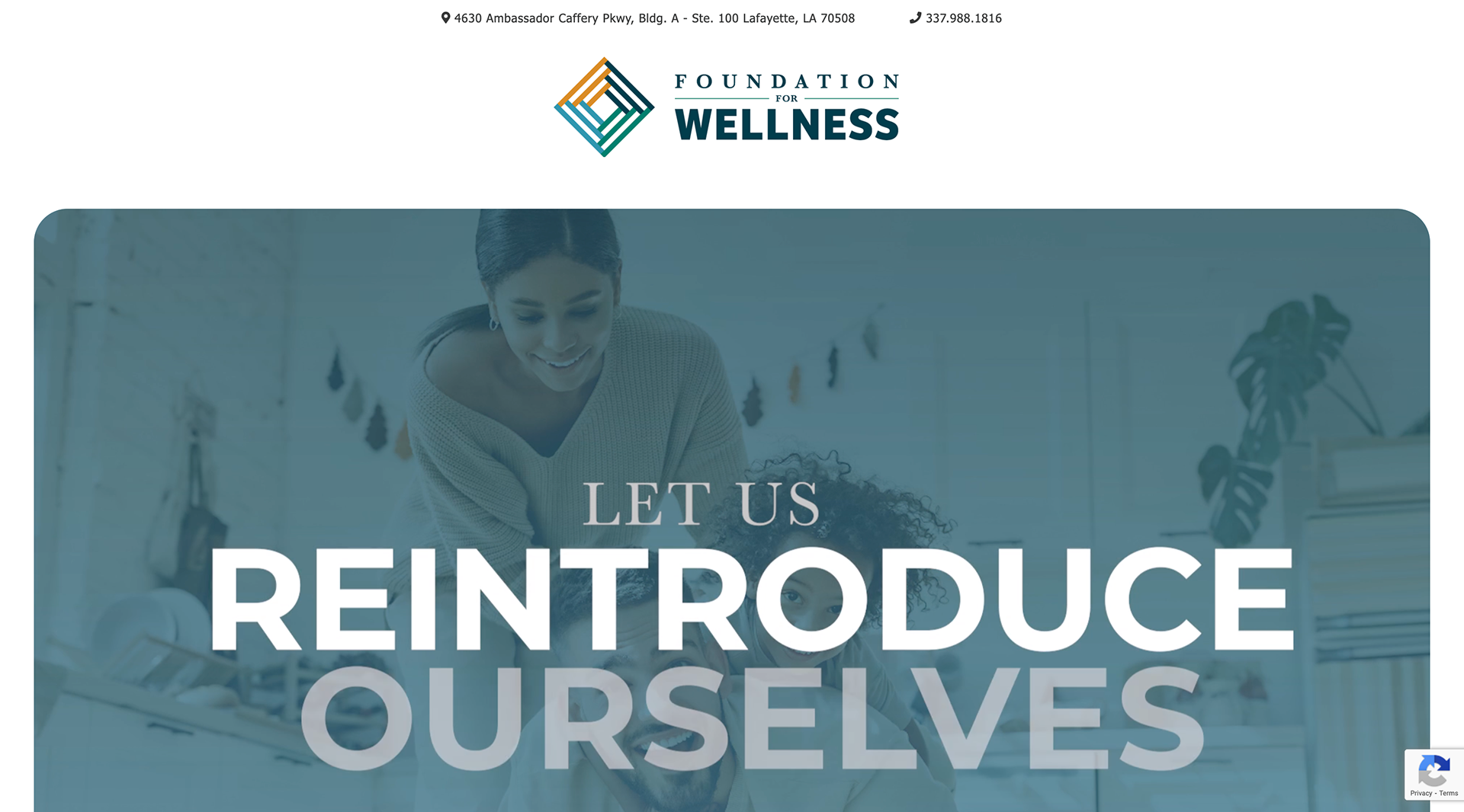
Woman's Foundation approached BBR Creative with the goal of renaming and rebranding themselves. As an established base in the community for over 40 years, it was time to bring their work into the modern age. A mark resembling an aerial view of a building was chosen to indicate the feeling of strength and stability this foundation brings. It's divided up into four quadrants as a node to the foundation's four areas of service.
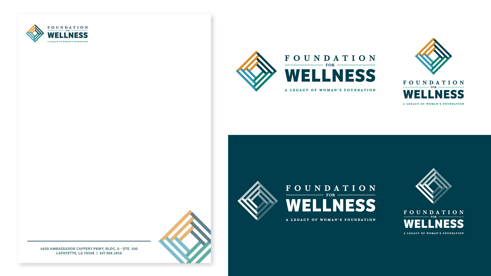
The foundation's new logo and letterhead.
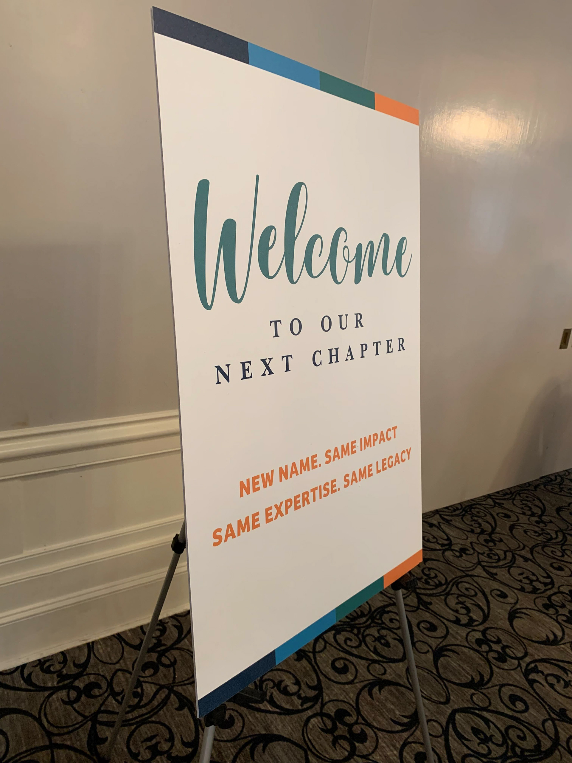
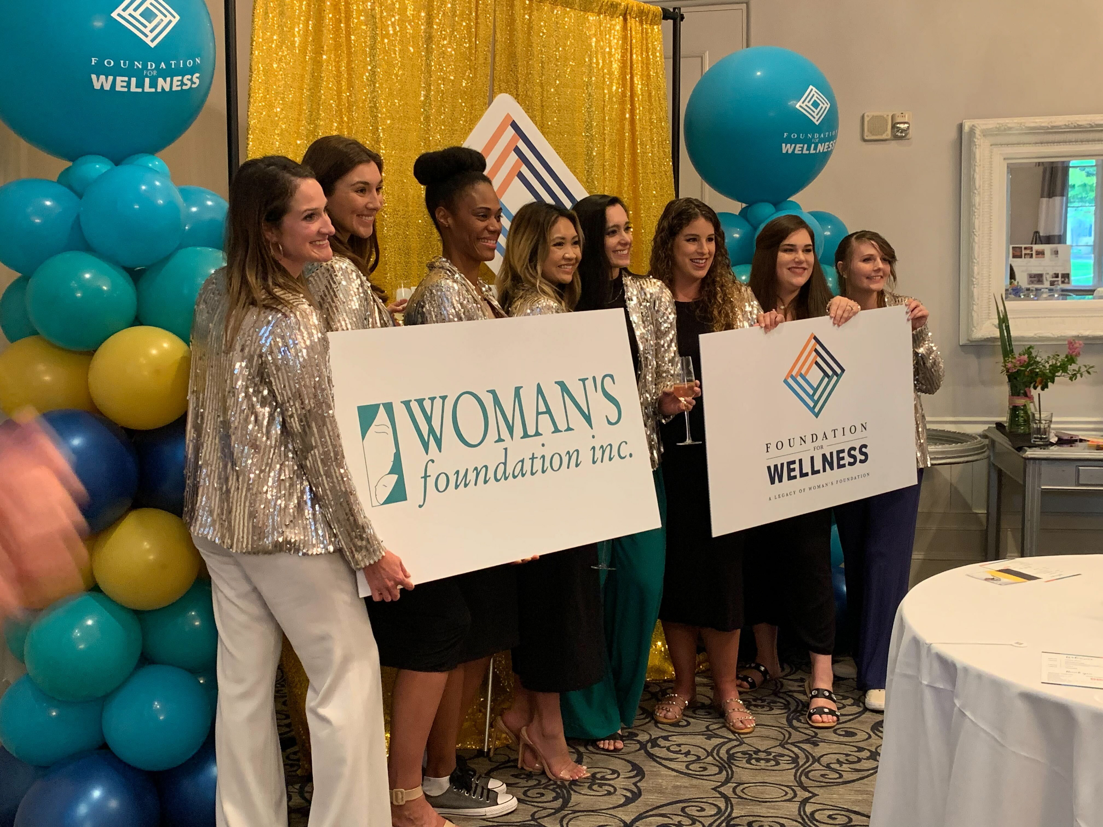
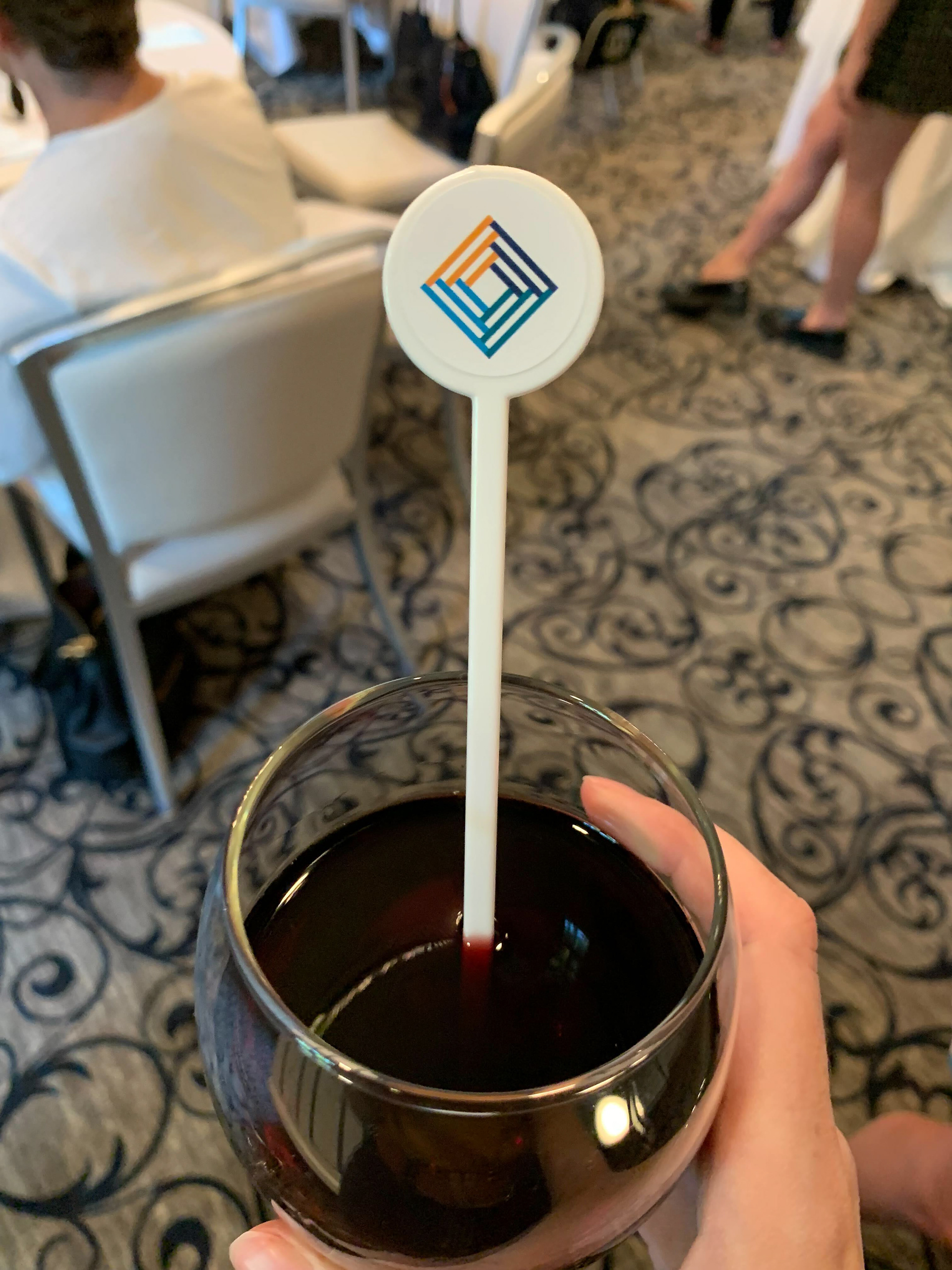
Photos from the rebranding unveiling event.
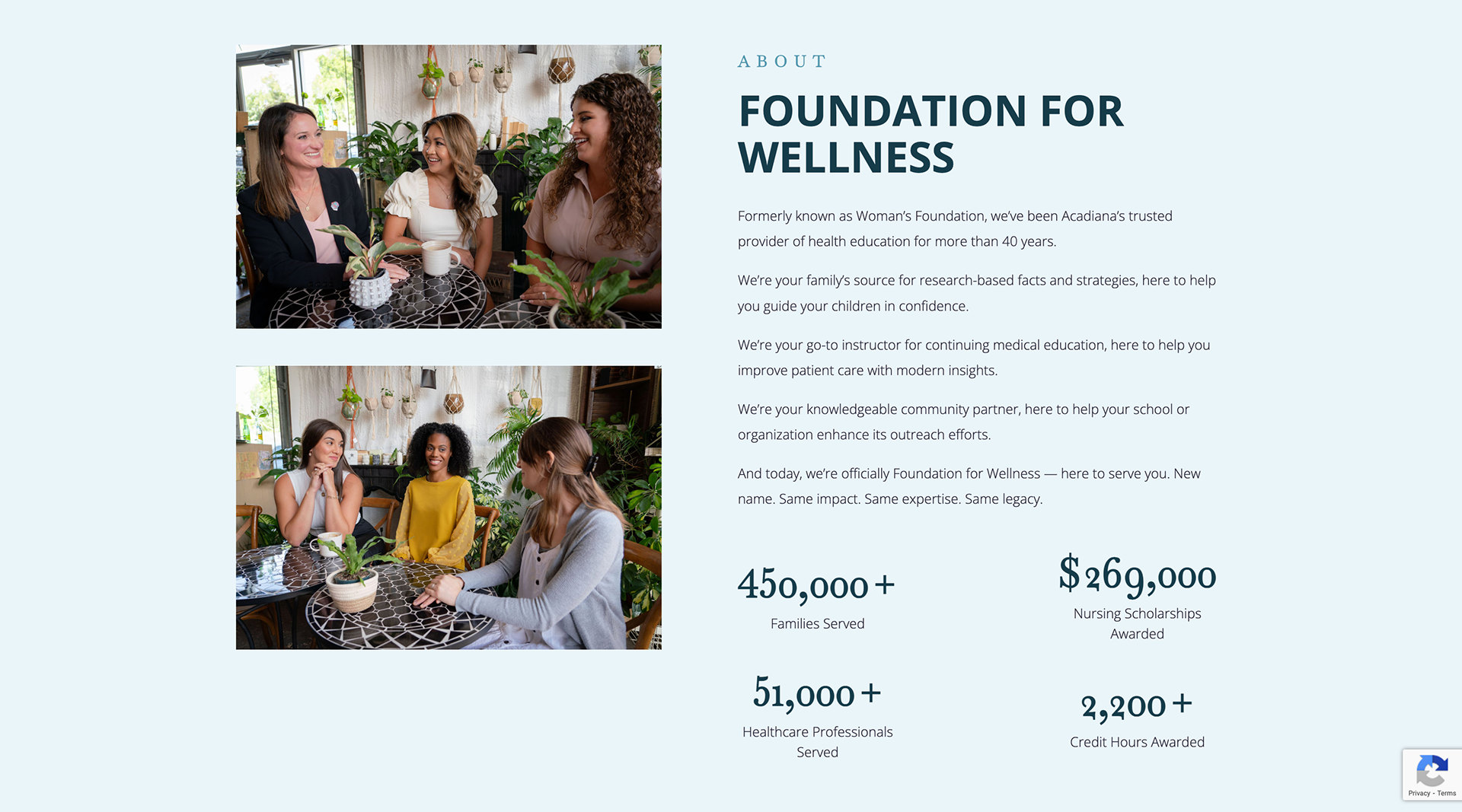
Screenshots from the Foundation's new website.